Widgets
Every widget you can put on your ZerryBit, what it shows, and the settings you can change.
Widgets are the building blocks of your ZerryBit screen. In the app you compose a screen from widgets: pick a widget, choose a size, place it on the grid, and adjust its settings. The device then renders everything as one crisp e-ink image on its refresh schedule.
Sizes and the grid
The screen is a 3-column × 2-row grid. Every widget comes in one or more sizes, named columns × rows:
| Size | Shape |
|---|---|
| 1×1 | One grid cell |
| 2×1 | Wide — two cells side by side |
| 1×2 | Tall — a full column |
| 2×2 | Large — two thirds of the screen |
| 3×2 | Full screen |
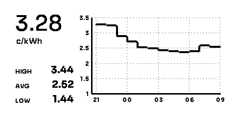
Most widgets support all five sizes, and the bigger the size, the more detail the widget shows — a 1×1 Electricity widget is a price gauge, while the 3×2 adds a full day chart and statistics. Each widget page below shows real renders of every size.
Some widgets also come in more than one view — a different way of presenting the same thing. Weather, for example, has a Current weather view and an 8-day Forecast view; you pick the view when adding the widget.
The widgets
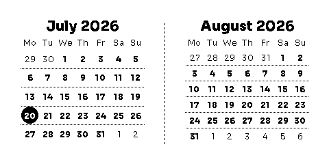
Calendar
A month at a glance, or a minimal date card.
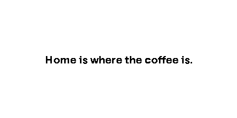
Custom text
Your own words, styled the way you want.
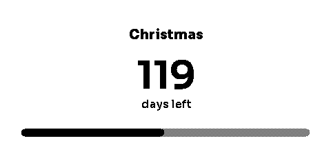
Days left
Count down to a date with a visual progress tracker.
Electricity
Day-ahead spot prices for your European price zone.
Fact of the day
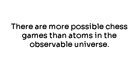
A fresh fact every day.
Home Assistant
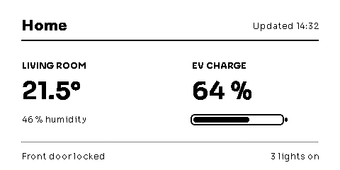
Your Home Assistant dashboard on e-ink.
Public transit
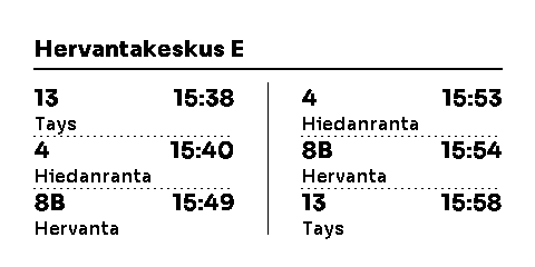
Upcoming departures for a Finnish stop or station.
Todo
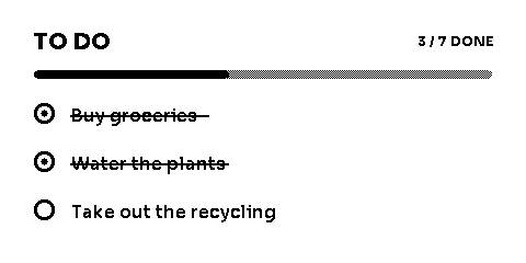
A checklist you manage from the app.
Weather
Current conditions or an 8-day forecast.
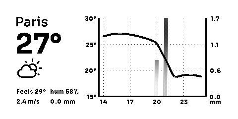
Every render on these pages is the widget's real output — this is exactly what the device draws, pixel for pixel.